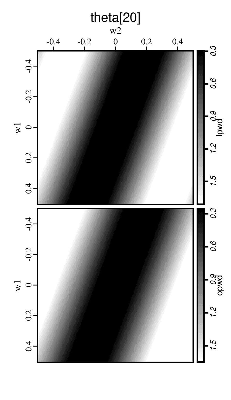
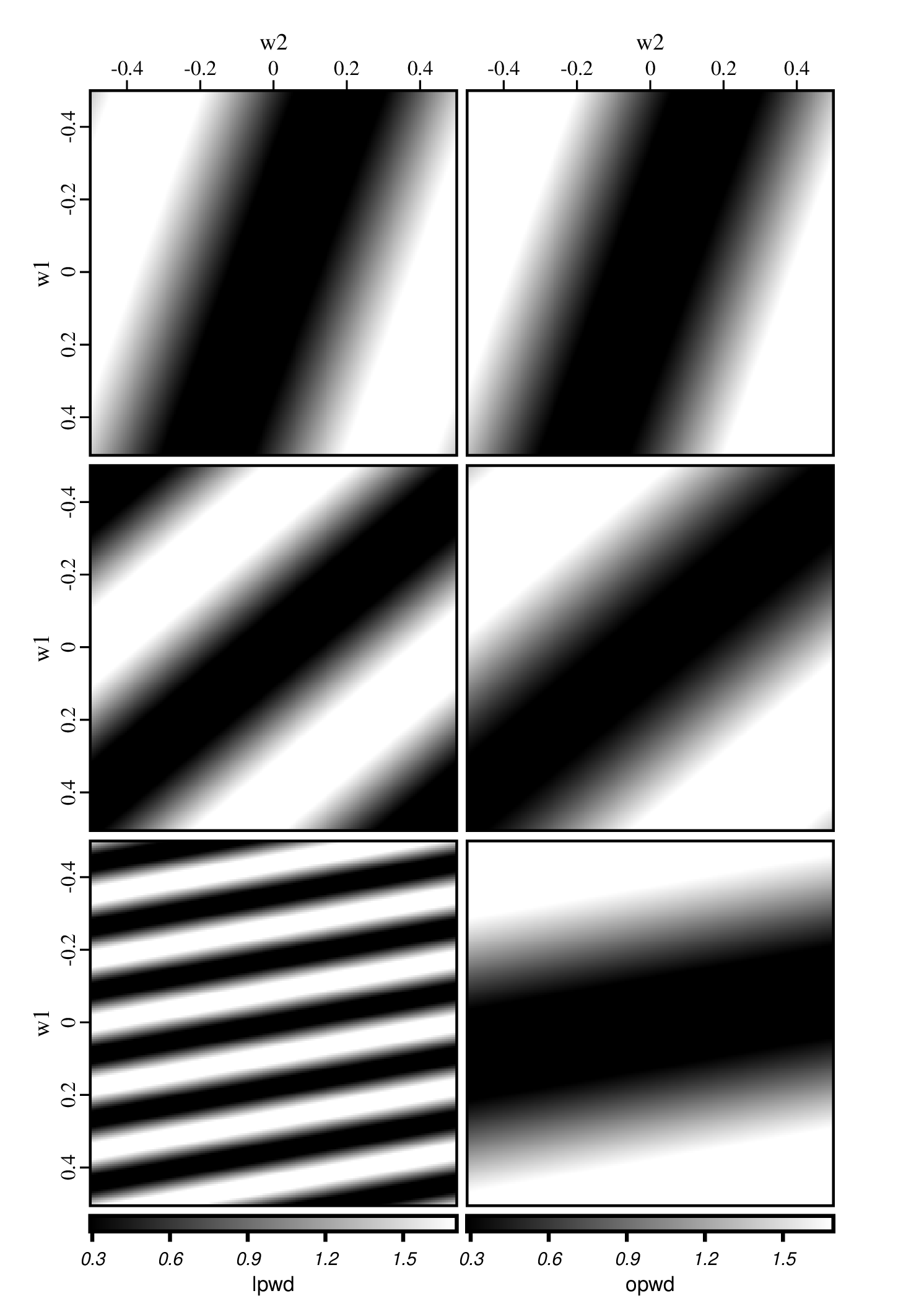
With our visualization tools, we can generate QC figures in different styles conveniently. We use the example of frequency analysis for plane-wave destructors to show how easy we can change the plotting styles.
- change the plot layouts to 2 columns for each vector and three rows for each thetas
Figure('./freq-123.png', 'freq',
	'''
	sgplotps left.label=w1 layout=vector
	''')
Figure('./freq-owb.png', 'freq',
	'''
	sgplotps left.label=w1 opwd.image=owb
	''')
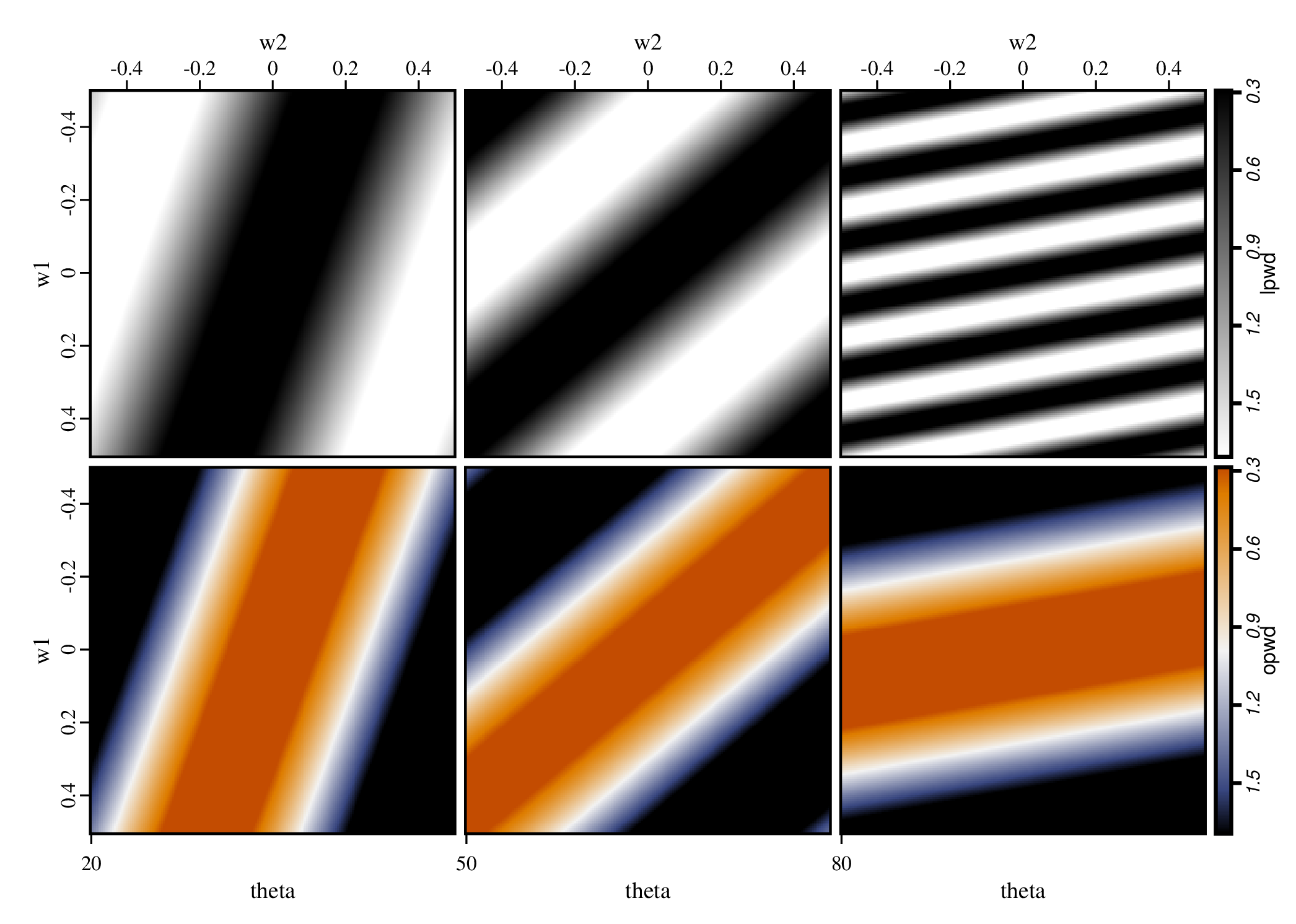
Figure('./freq-312.gif', 'freq',
	'''
	sgsort key=theta,w2
	| sgplotps left.label=w1 out.title=@group out.width=2
	''')